
---
title: Bento
description: Flexible bento grids for features, media, and metrics.
group: Blocks
order: 13
---

Bento layouts for mixing product details, media, and proof in one section. Replace the content and keep the rhythm.

## Mosaic

A mixed set of media, stats, avatars, branding, and a CTA. It stacks on narrow widths.

```tsx
"use client";

import {
  Avatar,
  AvatarFallback,
  AvatarGroup,
  AvatarImage,
} from "@/components/ui/avatar";
import { Button } from "@/components/ui/button";
import { cn } from "@/lib/utils";

type Bento01Props = {
  className?: string;
};

const AVATARS = [
  "/assets/brand/demos/avatars/avatar-1.png",
  "/assets/brand/demos/avatars/avatar-2.png",
  "/assets/brand/demos/avatars/avatar-3.png",
  "/assets/brand/demos/avatars/avatar-4.png",
  "/assets/brand/demos/avatars/avatar-5.png",
] as const;

function Mark({ className }: { className?: string }) {
  return (
    <img
      src="/assets/brand/logo/ui.svg"
      alt=""
      className={cn("brightness-0 dark:invert", className)}
    />
  );
}

export function Bento01({ className }: Bento01Props) {
  return (
    <section className={cn("@container w-full bg-background", className)}>
      <div className="mx-auto w-full max-w-5xl px-4 py-10 @[32rem]:px-6 @[32rem]:py-14">
        <div className="grid grid-cols-1 gap-3 @[32rem]:grid-cols-2 @[48rem]:grid-cols-4 @[48rem]:grid-rows-[minmax(11rem,1fr)_minmax(9rem,1fr)_minmax(10rem,1fr)]">
          {/* Tall image — full width on mobile, half on tablet, tall on desktop */}

          <div className="relative min-h-[14rem] overflow-hidden rounded-xl bg-muted @[32rem]:col-span-2 @[32rem]:min-h-[16rem] @[48rem]:col-span-1 @[48rem]:row-span-2">
            <img
              src="/assets/brand/demos/attachments/attachment-1.png"
              alt=""
              className="absolute inset-0 size-full object-cover"
            />
            <div
              aria-hidden="true"
              className="absolute inset-0 bg-gradient-to-t from-black/70 via-black/15 to-transparent"
            />
            <p className="absolute inset-x-0 bottom-0 p-4 text-sm font-medium tracking-wide text-white">
              Ship interfaces that feel finished
            </p>
          </div>

          {/* Big middle: pitch + CTA */}
          <div className="flex min-h-[16rem] flex-col justify-between rounded-xl bg-muted p-5 @[32rem]:col-span-2 @[48rem]:row-span-2">
            <Mark className="size-8" />
            <div className="mt-8 flex flex-1 flex-col justify-end gap-6">
              <p className="max-w-sm text-sm font-medium tracking-wide text-foreground">
                Build your interface with ready made blocks and modern design.
              </p>
              <div>
                <p className="text-3xl font-medium tracking-wide text-foreground">
                  Free
                </p>
                <p className="mt-1 text-sm tracking-wide text-muted-foreground">
                  Open source component library
                </p>
                <Button type="button" size="sm" className="mt-4">
                  Get started
                </Button>
              </div>
            </div>
          </div>

          {/* Stat */}
          <div className="flex min-h-[10rem] flex-col justify-between rounded-xl bg-muted p-5 @[32rem]:min-h-[11rem]">
            <p className="text-4xl font-medium tracking-wide text-foreground">
              95%
            </p>
            <p className="text-sm tracking-wide text-muted-foreground">
              Teams ship faster with reusable blocks.
            </p>
          </div>

          {/* Mark tile */}
          <div className="flex min-h-[10rem] items-center justify-center rounded-xl bg-muted p-5 @[32rem]:min-h-[11rem] @[48rem]:min-h-[9rem] @[48rem]:col-start-4 @[48rem]:row-start-2">
            <Mark className="size-12" />
          </div>

          {/* Social proof */}
          <div className="flex min-h-[10rem] flex-col justify-between rounded-xl bg-muted p-5 @[32rem]:col-span-1">
            <div>
              <p className="text-3xl font-medium tracking-wide text-foreground">
                300+
              </p>
              <p className="mt-1 text-sm tracking-wide text-muted-foreground">
                Blocks and patterns
              </p>
            </div>
            <AvatarGroup overlap="sm" className="mt-4">
              {AVATARS.map((src) => (
                <Avatar key={src} size="sm">
                  <AvatarImage src={src} alt="" />
                  <AvatarFallback>?</AvatarFallback>
                </Avatar>
              ))}
            </AvatarGroup>
          </div>

          {/* Wide mark — full row on tablet */}
          <div className="flex min-h-[10rem] items-center justify-center rounded-xl bg-muted p-5 @[32rem]:col-span-1 @[48rem]:col-span-2">
            <Mark className="size-14" />
          </div>

          {/* Image + copy — full width on mobile/tablet */}
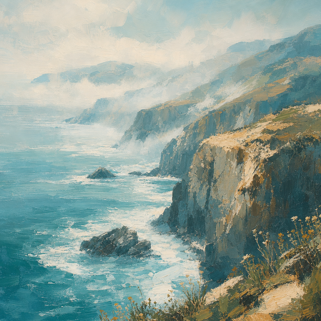
          <div className="relative min-h-[12rem] overflow-hidden rounded-xl bg-muted @[32rem]:col-span-2 @[48rem]:col-span-1 @[48rem]:min-h-[10rem]">
            <img
              src="/assets/brand/demos/attachments/attachment-3.png"
              alt=""
              className="absolute inset-0 size-full object-cover"
            />
            <div
              aria-hidden="true"
              className="absolute inset-0 bg-gradient-to-t from-black/70 via-black/20 to-transparent"
            />
            <div className="absolute inset-x-0 bottom-0 p-4">
              <p className="text-sm font-medium tracking-wide text-white">
                Rapid development
              </p>
              <p className="mt-1 text-xs tracking-wide text-white/75">
                Drop in blocks and keep shipping.
              </p>
            </div>
          </div>
        </div>
      </div>
    </section>
  );
}
```

### Installation

```bash
npx @arctis-sh/@arctis-sh/ui@latest add bento-01
```

### Usage

```tsx
import { Bento01 } from "@/components/blocks/bento/bento-01"
```

```tsx
<Bento01 />
```

## Feature bento

Uneven image tiles with concise copy overlays. They stack on narrow widths.

```tsx
"use client";

import { cn } from "@/lib/utils";

type Bento02Props = {
  className?: string;
};

const CELLS = [
  {
    title: "Token ready",
    description: "Restyle every block with your colors, radii, and type.",
    image: "/assets/brand/demos/attachments/attachment-1.png",
    className:
      "@[32rem]:col-span-2 @[32rem]:row-span-2 @[48rem]:col-span-2 @[48rem]:row-span-2",
  },
  {
    title: "Copy and ship",
    description: "Install a block and drop it into a page.",
    image: "/assets/brand/demos/attachments/attachment-2.png",
    className: "@[32rem]:col-span-2 @[48rem]:col-span-2",
  },
  {
    title: "Compose",
    description: "Mix sections freely.",
    image: "/assets/brand/demos/attachments/attachment-3.png",
    className: "@[32rem]:col-span-1 @[48rem]:col-span-1",
  },
  {
    title: "Accessible",
    description: "Keyboard-first defaults.",
    image: "/assets/brand/demos/attachments/attachment-4.png",
    className: "@[32rem]:col-span-1 @[48rem]:col-span-1",
  },
  {
    title: "Rapid development",
    description: "Ship interfaces that feel finished.",
    image: "/assets/brand/demos/attachments/attachment-5.png",
    className: "@[32rem]:col-span-2 @[48rem]:col-span-2",
  },
  {
    title: "Theme sync",
    description: "Light and dark out of the box.",
    image: "/assets/brand/demos/attachments/attachment-2.png",
    className: "@[32rem]:col-span-2 @[48rem]:col-span-2",
  },
] as const;

export function Bento02({ className }: Bento02Props) {
  return (
    <section className={cn("@container w-full bg-background", className)}>
      <div className="mx-auto w-full max-w-5xl px-4 py-10 @[32rem]:px-6 @[32rem]:py-14">
        <ul className="grid grid-cols-1 gap-3 @[32rem]:grid-cols-4 @[32rem]:auto-rows-[11rem]">
          {CELLS.map((cell) => (
            <li
              key={cell.title}
              className={cn(
                "group relative min-h-[12rem] overflow-hidden rounded-xl bg-muted @[32rem]:min-h-0",
                cell.className,
              )}
            >
              <img
                src={cell.image}
                alt=""
                className="absolute inset-0 size-full object-cover transition-transform duration-500 ease-out group-hover:scale-[1.03]"
              />
              <div
                aria-hidden="true"
                className="absolute inset-0 bg-gradient-to-t from-black/75 via-black/25 to-transparent"
              />
              <div className="absolute inset-x-0 bottom-0 p-4">
                <h3 className="text-sm font-medium tracking-wide text-white">
                  {cell.title}
                </h3>
                <p className="mt-1 text-xs tracking-wide text-white/75">
                  {cell.description}
                </p>
              </div>
            </li>
          ))}
        </ul>
      </div>
    </section>
  );
}
```

### Installation

```bash
npx @arctis-sh/@arctis-sh/ui@latest add bento-02
```

### Usage

```tsx
import { Bento02 } from "@/components/blocks/bento/bento-02"
```

```tsx
<Bento02 />
```

## Glow outline

Outlined tiles with a restrained glow that follows the cursor along the border.

```tsx
"use client";

import { useRef, type MouseEvent } from "react";
import { cn } from "@/lib/utils";

type Bento03Props = {
  className?: string;
};

const CELLS = [
  {
    title: "Token ready",
    description: "Restyle every block with your theme tokens.",
    image: "/assets/brand/demos/attachments/attachment-1.png",
    className: "@[32rem]:col-span-2 @[32rem]:row-span-2",
  },
  {
    title: "Copy and ship",
    description: "Install a block and drop it into a page.",
    image: "/assets/brand/demos/attachments/attachment-2.png",
    className: "@[32rem]:col-span-2",
  },
  {
    title: "Compose",
    description: "Mix sections freely.",
    image: "/assets/brand/demos/attachments/attachment-3.png",
    className: "",
  },
  {
    title: "Accessible",
    description: "Keyboard-first defaults.",
    image: "/assets/brand/demos/attachments/attachment-4.png",
    className: "",
  },
  {
    title: "Rapid development",
    description: "Ship interfaces that feel finished.",
    image: "/assets/brand/demos/attachments/attachment-5.png",
    className: "@[32rem]:col-span-2",
  },
  {
    title: "Theme sync",
    description: "Light and dark out of the box.",
    image: "/assets/brand/demos/attachments/attachment-2.png",
    className: "@[32rem]:col-span-2",
  },
] as const;

/** Visual reach past each tile so gaps between cards can light neighbors. */
const GLOW_REACH_PX = 160;
const GLOW_RADIUS = "16rem";

function GlowTile({
  className,
  title,
  description,
  image,
}: {
  className?: string;
  title: string;
  description: string;
  image: string;
}) {
  return (
    <li
      data-glow-tile
      data-glow="off"
      className={cn(
        "relative min-h-[12rem] rounded-xl p-px @[32rem]:min-h-0",
        "data-[glow=off]:![background:var(--border)]",
        className,
      )}
      style={{
        background: `radial-gradient(${GLOW_RADIUS} circle at var(--glow-x, 50%) var(--glow-y, 50%), rgb(120 200 255), rgb(190 140 255 / 0.85), rgb(255 180 140 / 0.4), var(--border) 55%)`,
      }}
    >
      <div className="flex size-full flex-col rounded-[calc(var(--radius-xl)-1px)] bg-background p-2">
        <div className="relative min-h-0 flex-1 overflow-hidden rounded-sm bg-muted">
          <img
            src={image}
            alt=""
            className="absolute inset-0 size-full object-cover"
          />
        </div>
        <div className="px-1 pt-3 pb-1">
          <h3 className="text-sm font-medium tracking-wide text-foreground">
            {title}
          </h3>
          <p className="mt-1 text-xs tracking-wide text-muted-foreground">
            {description}
          </p>
        </div>
      </div>
    </li>
  );
}

export function Bento03({ className }: Bento03Props) {
  const gridRef = useRef<HTMLUListElement>(null);

  function syncGlow(clientX: number, clientY: number) {
    const grid = gridRef.current;
    if (!grid) return;
    const tiles = grid.querySelectorAll<HTMLElement>("[data-glow-tile]");
    for (const el of tiles) {
      const rect = el.getBoundingClientRect();
      const w = el.offsetWidth;
      const h = el.offsetHeight;
      const x = ((clientX - rect.left) / Math.max(rect.width, 1)) * w;
      const y = ((clientY - rect.top) / Math.max(rect.height, 1)) * h;
      el.style.setProperty("--glow-x", `${x}px`);
      el.style.setProperty("--glow-y", `${y}px`);
      const near =
        clientX >= rect.left - GLOW_REACH_PX &&
        clientX <= rect.right + GLOW_REACH_PX &&
        clientY >= rect.top - GLOW_REACH_PX &&
        clientY <= rect.bottom + GLOW_REACH_PX;
      el.dataset.glow = near ? "on" : "off";
    }
  }

  function onMove(event: MouseEvent<HTMLUListElement>) {
    syncGlow(event.clientX, event.clientY);
  }

  function onLeave() {
    const grid = gridRef.current;
    if (!grid) return;
    for (const el of grid.querySelectorAll<HTMLElement>("[data-glow-tile]")) {
      el.dataset.glow = "off";
    }
  }

  return (
    <section className={cn("@container w-full bg-background", className)}>
      <div className="mx-auto w-full max-w-5xl px-4 py-10 @[32rem]:px-6 @[32rem]:py-14">
        <ul
          ref={gridRef}
          onMouseMove={onMove}
          onMouseLeave={onLeave}
          className="grid grid-cols-1 gap-3 @[32rem]:grid-cols-4 @[32rem]:auto-rows-[12.5rem]"
        >
          {CELLS.map((cell) => (
            <GlowTile
              key={cell.title}
              className={cell.className}
              title={cell.title}
              description={cell.description}
              image={cell.image}
            />
          ))}
        </ul>
      </div>
    </section>
  );
}
```

### Installation

```bash
npx @arctis-sh/@arctis-sh/ui@latest add bento-03
```

### Usage

```tsx
import { Bento03 } from "@/components/blocks/bento/bento-03"
```

```tsx
<Bento03 />
```
