A traveling highlight on the outline of a surface. Use it on cards, outline buttons, and outline badges. Tune the colors and duration.
Cards
Color 1
Color 2
Color 3
8s
28
tsx
import { Beam } from "@/components/motion/beam"import { Card, CardDescription, CardHeader, CardTitle,} from "@/components/ui/card"export function Example() { return ( <div className="grid w-full max-w-lg grid-cols-1 gap-3 sm:grid-cols-2"> <Beam colors={["#78c8ff", "#be8cff", "#ffb48c"]} duration={8} size={28} > <Card className="border-0 bg-transparent shadow-none hover:bg-transparent dark:hover:bg-transparent"> <CardHeader> <CardTitle>Token ready</CardTitle> <CardDescription> Restyle every surface with your theme. </CardDescription> </CardHeader> </Card> </Beam> <Beam colors={["#78c8ff", "#be8cff", "#ffb48c"]} duration={8} size={28} > <Card className="border-0 bg-transparent shadow-none hover:bg-transparent dark:hover:bg-transparent"> <CardHeader> <CardTitle>Copy and ship</CardTitle> <CardDescription> Drop a piece in and keep moving. </CardDescription> </CardHeader> </Card> </Beam> </div> )}Buttons
Outline only. Hover lights the full outline.
Color 1
Color 2
Color 3
8s
28
tsx
import { Beam } from "@/components/motion/beam"import { Button } from "@/components/ui/button"export function Example() { return ( <div className="flex flex-wrap items-center justify-center gap-3"> <Beam colors={["#78c8ff", "#be8cff", "#ffb48c"]} duration={8} size={28} hoverFull > <Button variant="outline" className="border-0 bg-transparent shadow-none hover:bg-transparent dark:hover:bg-transparent"> Continue </Button> </Beam> <Beam colors={["#78c8ff", "#be8cff", "#ffb48c"]} duration={8} size={28} hoverFull > <Button variant="outline" className="border-0 bg-transparent shadow-none hover:bg-transparent dark:hover:bg-transparent"> Get started </Button> </Beam> </div> )}Badges
Outline only.
Color 1
Color 2
Color 3
8s
28
tsx
import { Beam } from "@/components/motion/beam"import { Badge } from "@/components/ui/badge"export function Example() { return ( <div className="flex flex-wrap items-center justify-center gap-3"> <Beam colors={["#78c8ff", "#be8cff", "#ffb48c"]} duration={8} size={28} > <Badge variant="outline" className="h-6 px-2.5 border-0 bg-transparent shadow-none hover:bg-transparent dark:hover:bg-transparent"> New </Badge> </Beam> <Beam colors={["#78c8ff", "#be8cff", "#ffb48c"]} duration={8} size={28} > <Badge variant="outline" className="h-6 px-2.5 border-0 bg-transparent shadow-none hover:bg-transparent dark:hover:bg-transparent"> Live </Badge> </Beam> </div> )}Grid
A bento layout where the outline lights up under the pointer. The glow reaches past each tile so neighbors catch it across the gaps.

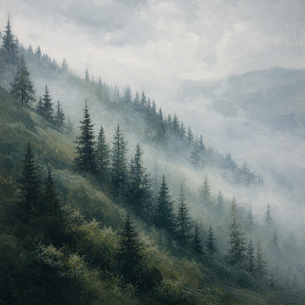
Token ready
Restyle every tile with your theme tokens.
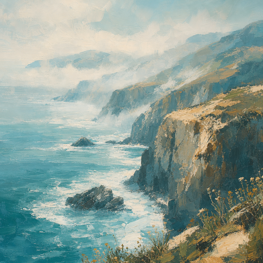
Copy and ship
Install a tile and drop it into a page.
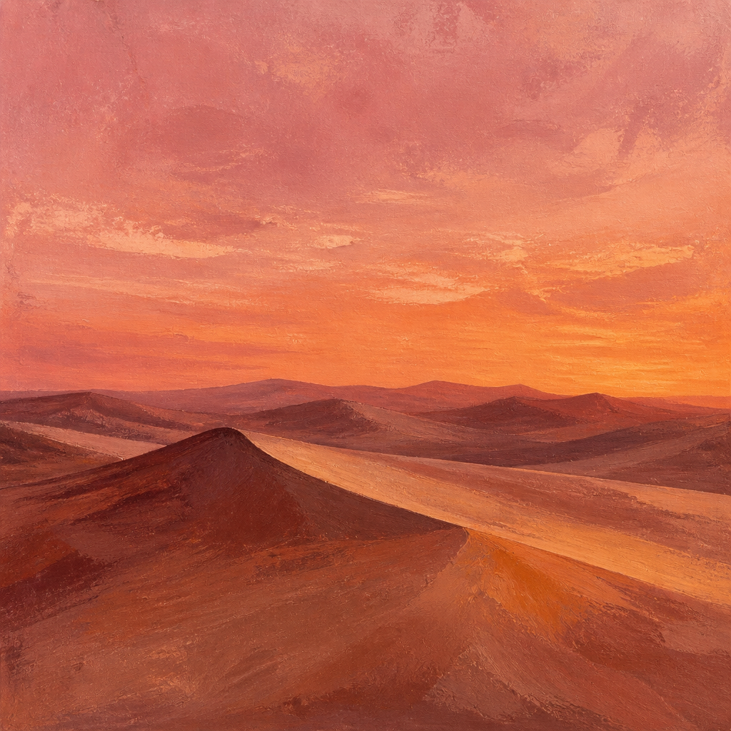
Compose
Mix sections freely.
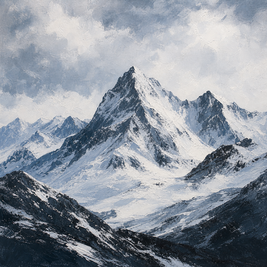
Accessible
Keyboard first defaults.
Rapid development
Ship interfaces that feel finished.
Theme sync
Light and dark out of the box.
Color 1
Color 2
Color 3
16rem
tsx
"use client"import { useRef, type MouseEvent } from "react"import { cn } from "@/lib/utils"const TILES = [ { title: "Token ready", description: "Restyle every tile with your theme tokens.", image: "/assets/brand/demos/attachments/attachment-1.png", className: "sm:col-span-2 sm:row-span-2", }, { title: "Copy and ship", description: "Install a tile and drop it into a page.", image: "/assets/brand/demos/attachments/attachment-2.png", className: "sm:col-span-2", }, { title: "Compose", description: "Mix sections freely.", image: "/assets/brand/demos/attachments/attachment-3.png", className: "", }, { title: "Accessible", description: "Keyboard first defaults.", image: "/assets/brand/demos/attachments/attachment-4.png", className: "", }, { title: "Rapid development", description: "Ship interfaces that feel finished.", image: "/assets/brand/demos/attachments/attachment-5.png", className: "sm:col-span-2", }, { title: "Theme sync", description: "Light and dark out of the box.", image: "/assets/brand/demos/attachments/attachment-2.png", className: "sm:col-span-2", },]const GLOW_REACH_PX = 160const GLOW_RADIUS = "16rem"export function Example() { const gridRef = useRef<HTMLUListElement>(null) function syncGlow(clientX: number, clientY: number) { const grid = gridRef.current if (!grid) return for (const el of grid.querySelectorAll<HTMLElement>("[data-glow-tile]")) { const rect = el.getBoundingClientRect() const x = ((clientX - rect.left) / Math.max(rect.width, 1)) * el.offsetWidth const y = ((clientY - rect.top) / Math.max(rect.height, 1)) * el.offsetHeight el.style.setProperty("--glow-x", `${x}px`) el.style.setProperty("--glow-y", `${y}px`) const near = clientX >= rect.left - GLOW_REACH_PX && clientX <= rect.right + GLOW_REACH_PX && clientY >= rect.top - GLOW_REACH_PX && clientY <= rect.bottom + GLOW_REACH_PX el.dataset.glow = near ? "on" : "off" } } function onLeave() { const grid = gridRef.current if (!grid) return for (const el of grid.querySelectorAll<HTMLElement>("[data-glow-tile]")) { el.dataset.glow = "off" } } return ( <ul ref={gridRef} onMouseMove={(event: MouseEvent<HTMLUListElement>) => syncGlow(event.clientX, event.clientY) } onMouseLeave={onLeave} className="grid w-full max-w-2xl grid-cols-1 gap-3 sm:auto-rows-[10rem] sm:grid-cols-4" > {TILES.map((tile) => ( <li key={tile.title} data-glow-tile data-glow="off" className={cn( "group relative min-h-40 overflow-hidden rounded-xl bg-[var(--border)] p-px sm:min-h-0", tile.className, )} > <span aria-hidden className="pointer-events-none absolute inset-0 z-[1] rounded-[inherit] opacity-0 transition-opacity duration-300 group-data-[glow=on]:opacity-100" style={{ background: `radial-gradient(${GLOW_RADIUS} circle at var(--glow-x, 50%) var(--glow-y, 50%), #78c8ff, #be8cff, #ffb48c, transparent 55%)`, }} /> <div className="relative z-10 flex size-full flex-col overflow-hidden rounded-[calc(var(--radius-xl)-1px)] bg-background p-2"> <div className="relative min-h-0 flex-1 overflow-hidden rounded-sm bg-muted"> <img src={tile.image} alt="" className="absolute inset-0 size-full object-cover" /> </div> <div className="px-1 pt-3 pb-1"> <h3 className="text-sm font-medium tracking-wide text-foreground"> {tile.title} </h3> <p className="mt-1 text-xs tracking-wide text-muted-foreground"> {tile.description} </p> </div> </div> </li> ))} </ul> )}Installation
npx @arctis-sh/@arctis-sh/ui@latest add beamUsage
import { Beam } from "@/components/motion/beam"import { Button } from "@/components/ui/button"<Beam hoverFull> <Button variant="outline" className="border-0 bg-transparent shadow-none"> Continue </Button></Beam>API Reference
Beam
| Prop | Type | Default |
|---|---|---|
| colors | [string, string, string] | ["#78c8ff", "#be8cff", "#ffb48c"] |
| duration | number | 8 |
| size | number | 28 |
| borderWidth | number | 1 |
| hoverFull | boolean | false |
| className | string | — |
| children | ReactNode | — |
Also accepts the other native div attributes. size is the lit arc length as a percent of the outline (clamped 10-80).